
brand style guide
How Givington's looks, sounds and shows up. Use this guide to keep everything made for Givington's—either by our team or by our partners and vendors— unmistakably ours...or else!

content, community, commerce
We help content-driven brands create and move products. From Fayetteville, Arkansas, to the world!
Who we serve
What we do
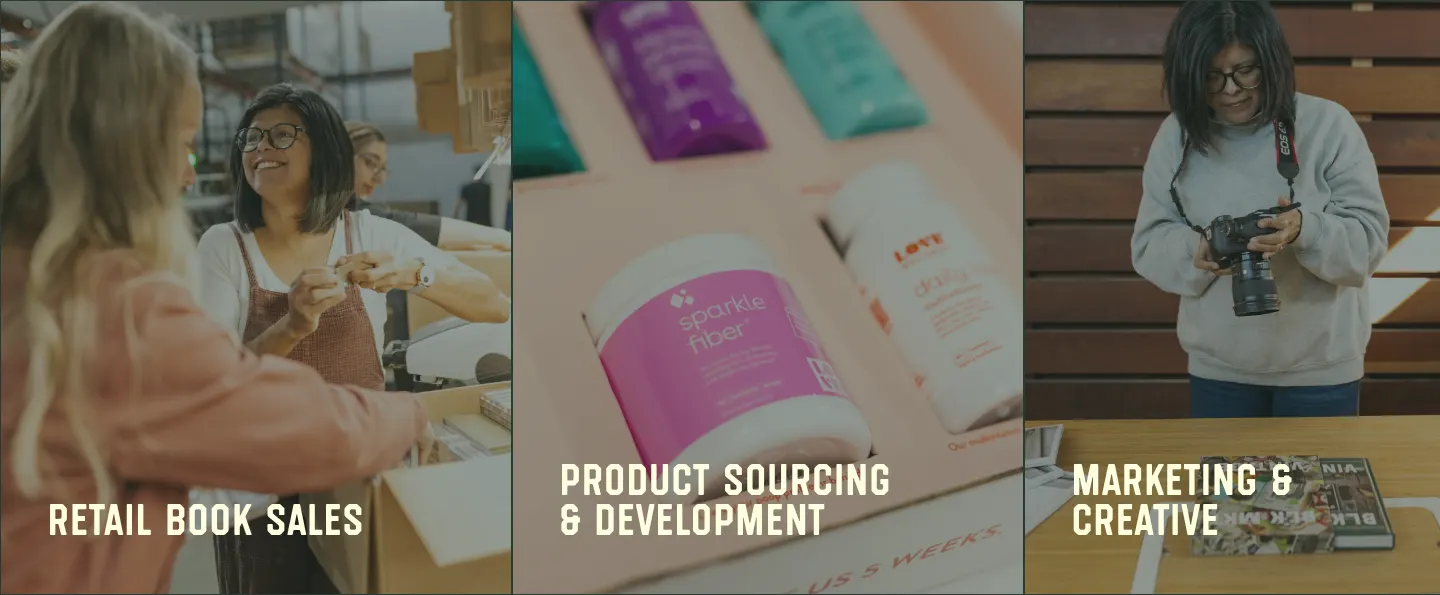
- 01retail book sales
- Book launches and bulk sales
- Sales reported to The New York Times, NPD BookScan and more
- Pre-order strategies that build momentum
- The best price on books
- Event sales reporting
- Custom offerings: inserts, custom boxes, supporting products and digital content
- 02product sourcing & development
- Connections to suppliers
- Products designed and developed from scratch
- Concept to creation, from first idea and mock-ups to warehouse delivery
- Printed products: hard and soft cover books, coffee table books, study guides, planners, journals and card decks
- Beyond books: custom merch, apparel, drinkware and specialty toys
- Merch for creators, sourced, developed, stored and shipped
- 03marketing & creative
- Websites
- Email campaigns and social content
- Book trailers and animated summaries
- The right message to the right people
- Flexible options for all budgets
- 04E-commerce management
- Ecommerce platforms, built and managed
- Shopify storefronts
- Inventory management
- Storefronts kept optimized and up to date
- 05fulfillment
- Where Givington's started, and still the core of our operations in Fayetteville, Arkansas
- Storage and shipping for books and merch
- Mail at scale: 40,000 books to 40,000 people in five days
- Fast, flexible and friendly service tailored to your needs
How we show up
Our tagline reflects Givington's excellent, people-forward service. Everything we do is built around our partners—their ideas, dreams, and goals. We do the hard work, so they can do the fun stuff.
Why we do it
Whatever we do, our work is first and foremost a vehicle for meaningful relationships. Whether serving a truck driver dropping off pallets or a New York publishing house executive, we show up because we believe people matter.
three marks
Givington's has three marks: the wordmark, the "G" icon, and the badge, with its "Built Around You" bar. Always use the official logo files; never recolor, outline, stretch, rebuild or retype a mark.



Approved colorways
Marks come in Red, Cream, Charcoal, Black and White. Use red marks on cream and cream marks on red, charcoal or photography. Charcoal marks are for one-color print and partner placements.
Black & white: only for black-and-white deliverables


Never do this

Email signatures use the animated G logo. Download it with the other marks in Get the files.
five colors
Red, blue, yellow, cream and charcoal. Cream is the primary background color; red carries the headlines and calls to action; charcoal carries the words; blue is the accent; and yellow is kept to 1px rules and other small accents. No gradients, no shadows.
- Hex
- #B83B28
- RGB
- 184 59 40
- CMYK
- 20 90 98 10
Headlines on cream. CTA bands with cream type.
- Hex
- #5BB2BC
- RGB
- 91 178 188
- CMYK
- 63 11 26 0
Accents, panels, display text at 20px and up.
- Hex
- #FDC355
- RGB
- 253 195 85
- CMYK
- 0 25 77 0
1px section rules and small accents. Never a background.
- Hex
- #FFFFE0
- RGB
- 255 255 224
- CMYK
- 1 0 14 0
The preferred background. All type on dark grounds.
- Hex
- #293A33
- RGB
- 41 58 51
- CMYK
- 76 55 67 90
Body copy. Footers and dark sections.
Backgrounds
Note: Dark grounds use charcoal, never black.
Supporting values
| White #FFFFFF | An occasional background (see left) and the White marks. |
| Black #000000 | The Black marks and the hero scrim only. Never a background. |
| Scrim 65% | Black at 65%, only over hero imagery with text on top. |
Approved pairings and contrast
| Sample | Pairing | Contrast | Use |
|---|---|---|---|
| aa | Charcoal on cream | 11.81:1 | Body copy |
| aa | Cream on charcoal | 11.81:1 | All type on dark sections |
| aa | Red on cream | 5.58:1 | Headlines |
| aa | Cream on red | 5.58:1 | CTA bands and buttons |
| aa | Blue on charcoal | 4.89:1 | Display text |
| aa | Blue on cream | 2.42:1 | 20px and larger only |
| aa | Yellow on red | 3.55:1 | Never |
| aa | Red on charcoal | 2.11:1 | Never |
Do
- Let cream do most of the work.
- Set headlines in red on cream, and body copy in charcoal.
- Use yellow for 1px section rules and small accents.
- Use blue as an accent or a panel, and for text only at 20px and up.
Don't
- Use yellow as a background, as text on cream, or as text or buttons on red.
- Set red text on charcoal.
- Use black as a background.
- Add gradients, shadows or blurs.
two fonts
Westcraft Sans Soft sets headers and special moments. Gibson does everything else: body copy, labels, buttons and navigation. Two families.
The one rule: no capitals in Westcraft
Type every Westcraft word in lowercase, including first words of a sentence, names, acronyms and "givington's" itself. For example, type "dtc brands", never "DTC Brands" when using the Westcraft font. The only capitals that ever appear in this font are the G and S of the Givington's logo, and that's artwork (never typed out). Canva, Word, Figma and email won't apply this for you; you will need to remember to do this yourself when typing out words in this font.
The scale (website, desktop)
Do
- Westcraft for headlines, lowercase, at weight 400.
- Gibson in sentence case for body copy.
- Gibson in UPPERCASE for nav, buttons and small labels.
- Center hero and section intros; left-align feature grids and splits.
Don't
- Type capitals in Westcraft, ever.
- Bold, italicize or track out Westcraft.
- Set body copy in Westcraft.
the overlap
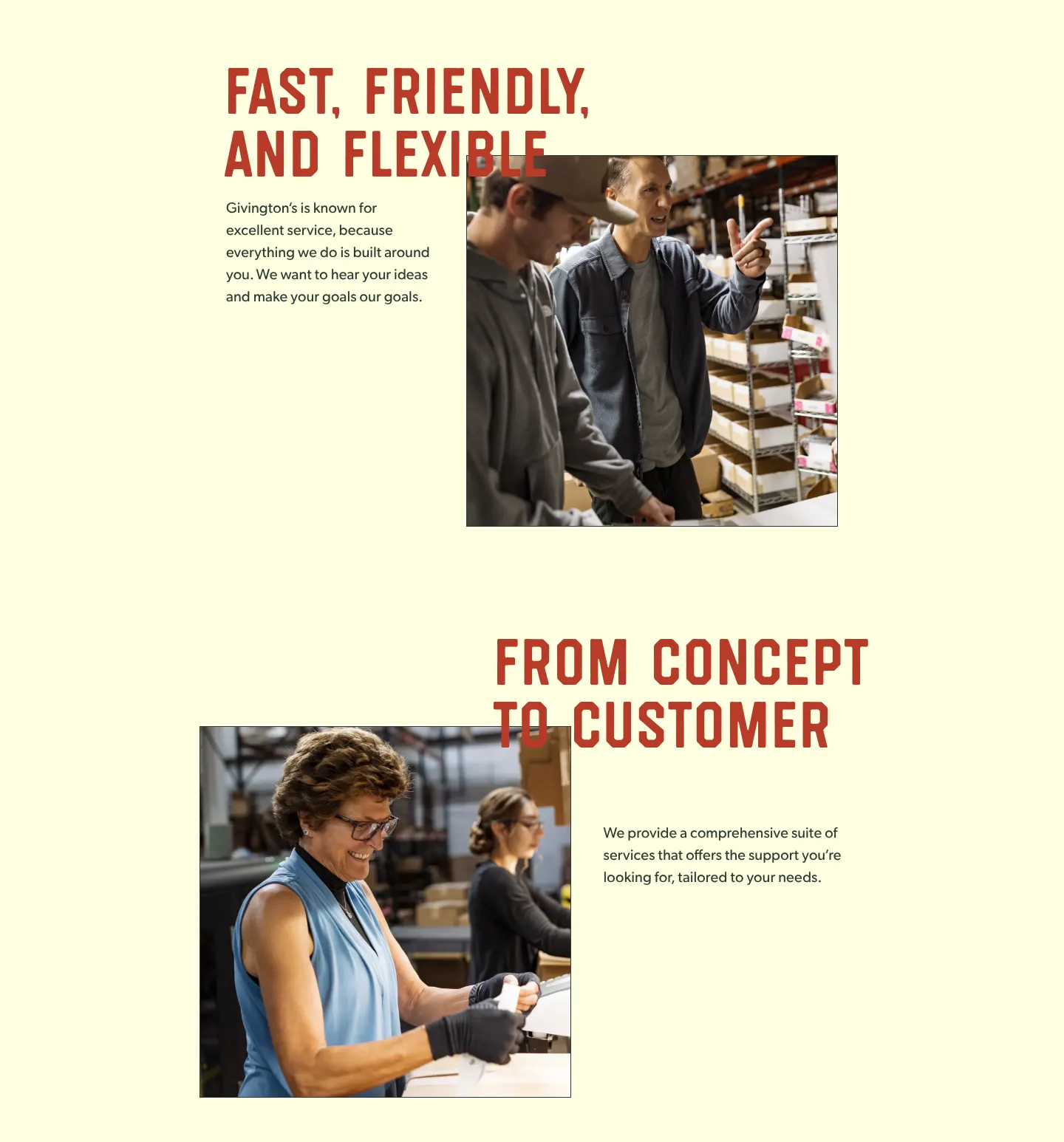
A core design element is a big headline that runs over the edge of a photo or video. Use it for story beats across pages and media.
Givington's is known for excellent service, because everything we do is built around you.

On the website: a display-1 headline (Westcraft 100/85) over a 503px square photo with a 1px charcoal frame.
Photos dimmed onto color



Do
- Let the headline cross the image edge, not sit beside it.
- Keep photos square-cornered with a 1px charcoal frame on cream.
- Get depth from color fields, dimmed photos and overlap.
Don't
- Add shadows, blurs or gradients.
- Use the 65% scrim anywhere but hero imagery with text on top.
- Round the corners of photos.
FEW, SIMPLE icons
So far, we have only needed five small icons for the website: the Facebook, Instagram, X and LinkedIn marks, and a carousel arrow. The set is limited because we haven't needed more yet—not because more aren't allowed. When a project calls for a new icon, keep it consistent with these, or let's chat further about a full icon system.
Social · cream, 15px


 Shown at 2×
Cream in the header (over the hero) and on the charcoal footer.
Also in the icon set · Carousel arrow, 28px, 2px stroke


The icon files also include red social marks, and the arrow in blue, charcoal and cream.
Do
- Use the traced icon files from Get the files.
- Keep social icons at 15px.
- Keep new icons consistent with the existing set.
- Use emoji in casual copy (see Voice & tone).
Don't
- Mix in icons that don't match the set.
- Decorate with icons.
how we sound
We speak as "we" to "you", like a capable friend taking work off someone's plate. Warm, quick and a little cheeky. Confident, never mean, and never joking at the client's expense. In casual copy, an emoji or two fits right in.
"For authors and creators who are building their businesses, we take the operational load off your plate, so you can focus on what you love."FROM THE Website
"You don't have time to manage launches; you just need them to do well. We'll serve up fast, seamless, and personalized solutions to make your job easier."FROM THE Website
KEEP HEADLINES short and punchy
Favor rhythm and lists of three, broken up with commas or periods.
- content, community, commerce
- from concept to customer
- fast, friendly, and flexible
- tailored solutions. crazy fast execution.
- sell it. ship it, report it.
A little swagger is on-brand
- how's your merch game?
- it's ok to have fun
- and we still kill it
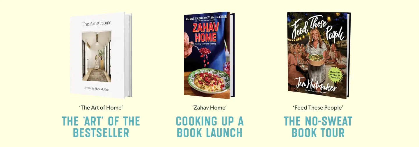
- the no-sweat book tour
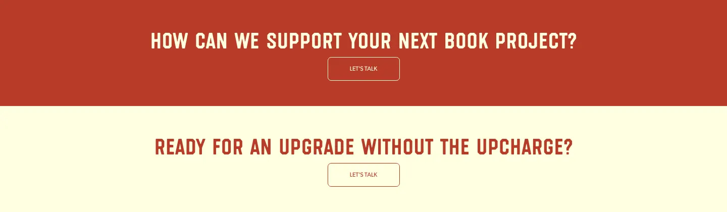
- ready for an upgrade without the upcharge?
Questions make good calls to action
Case studies tell the story
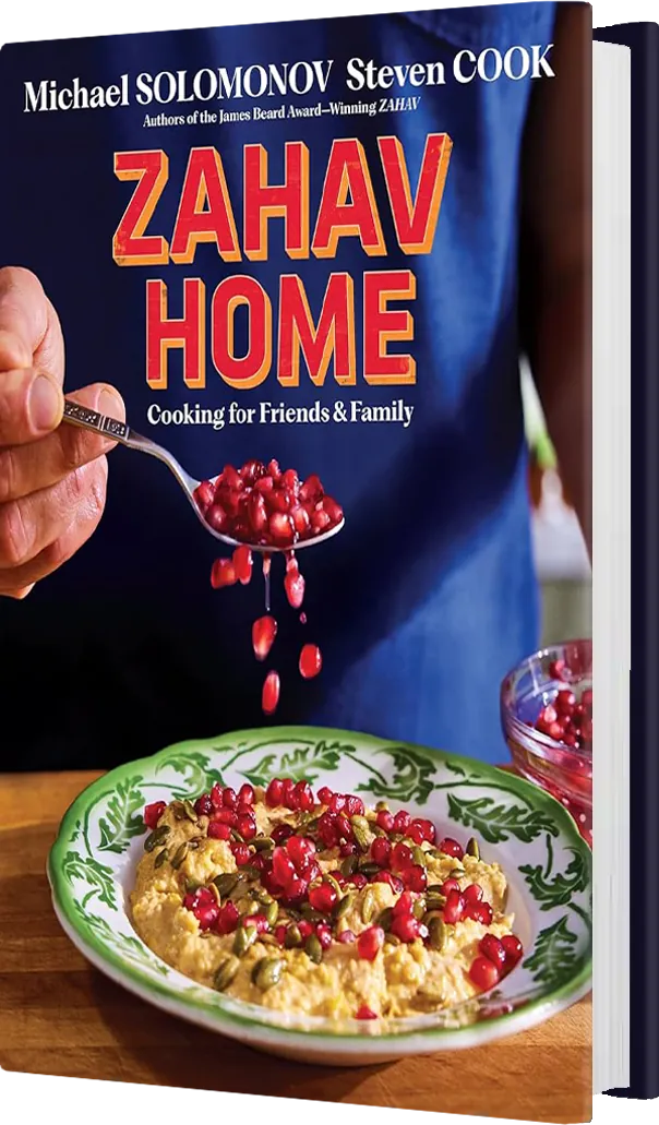
Put book titles in curly single quotes in headlines or italics when in body copy.
Mechanics
- Westcraft is lowercase. Gibson body copy is sentence case.
- Labels are UPPERCASE Gibson: nav, buttons, switcher options.
- Curly quotes around titles of work: ‘Zahav Home’.
- Emoji are welcome in casual copy, like social posts, emails and messages. They fit our friendly voice.
Don't
- Get mean, or joke at the client's expense.
- Decorate with icons.
real people, real work
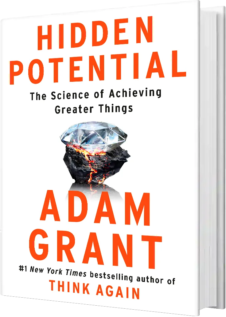
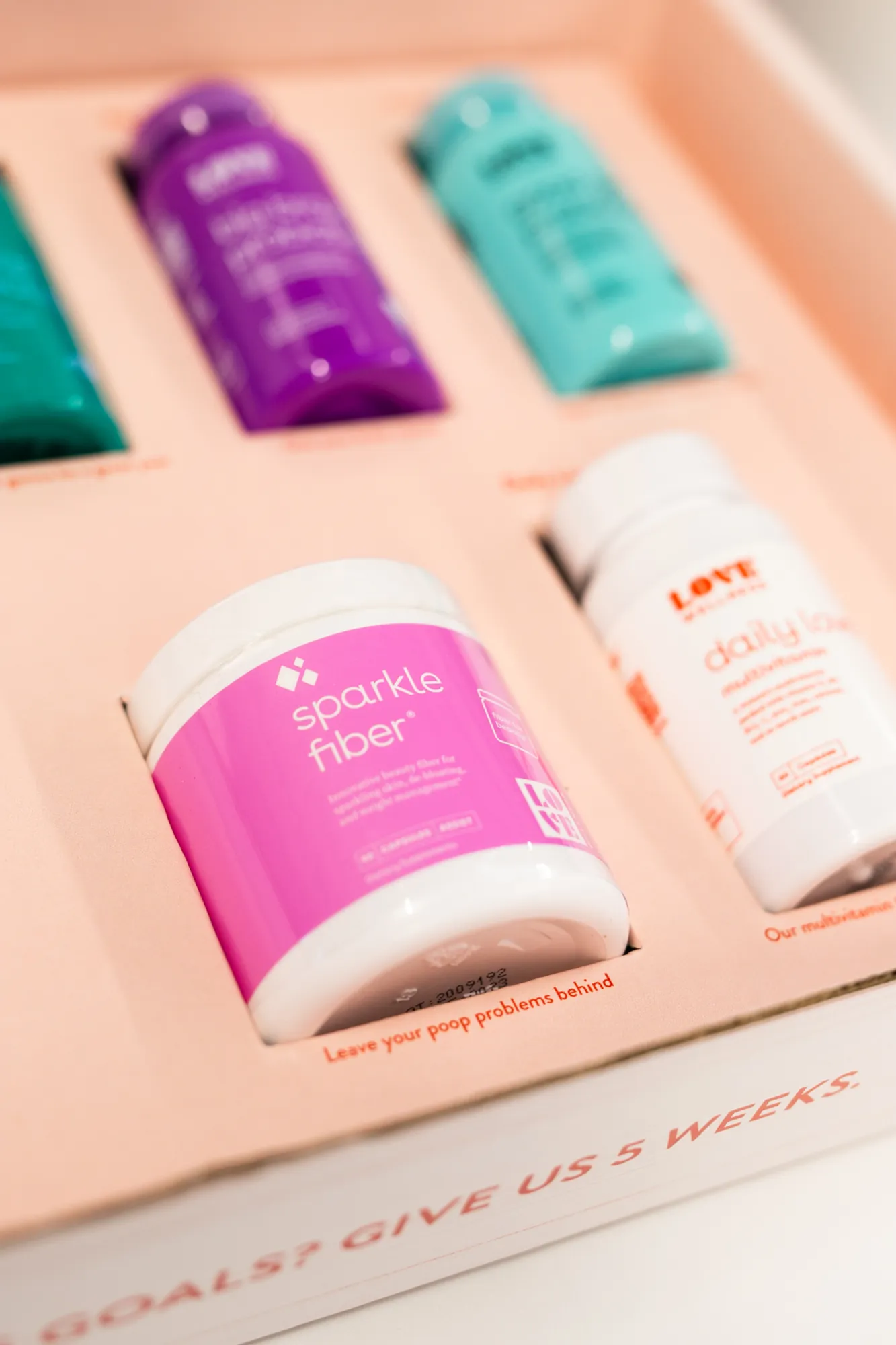
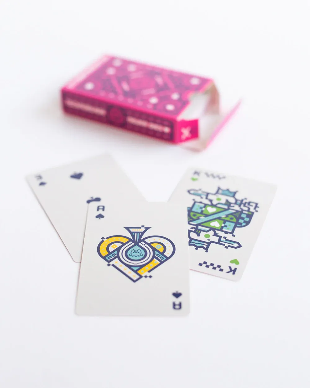
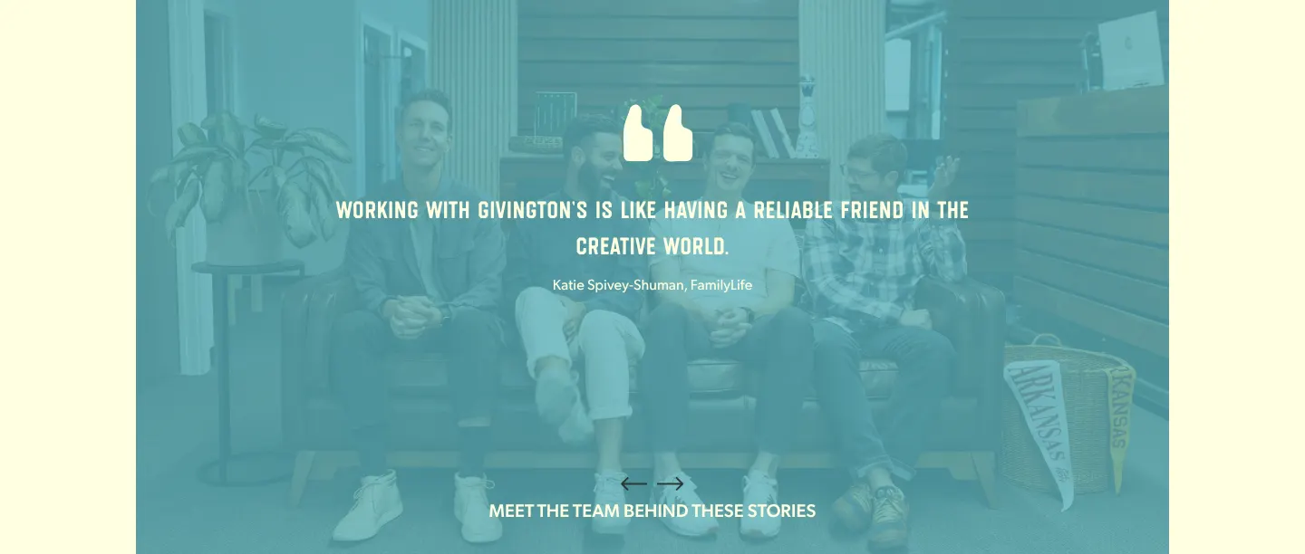
Show real Givington's people in the warehouse and studio: packing orders, laughing on the office sofa, checking a product. Warm, candid and naturally lit. Avoid stock photography.

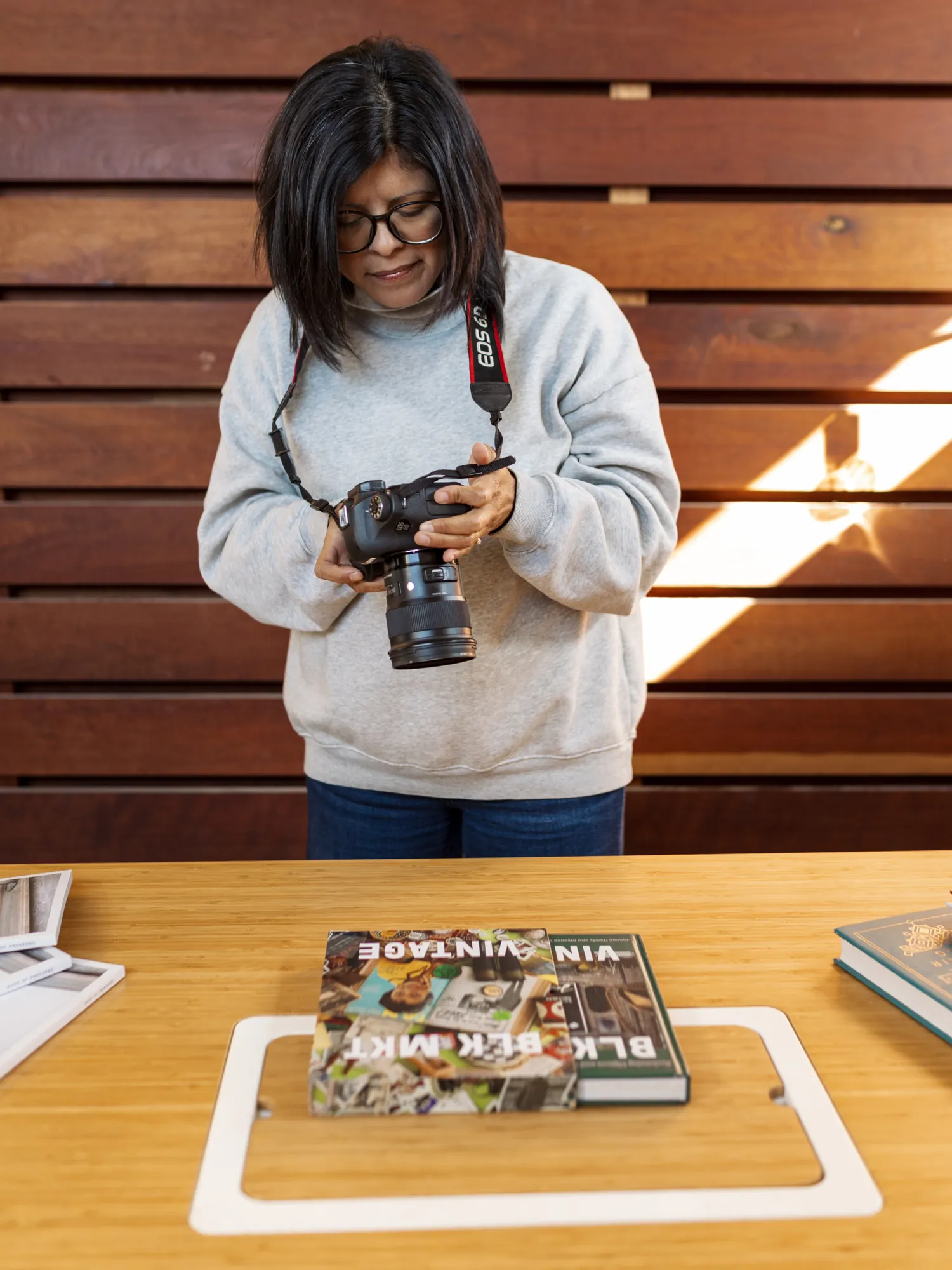
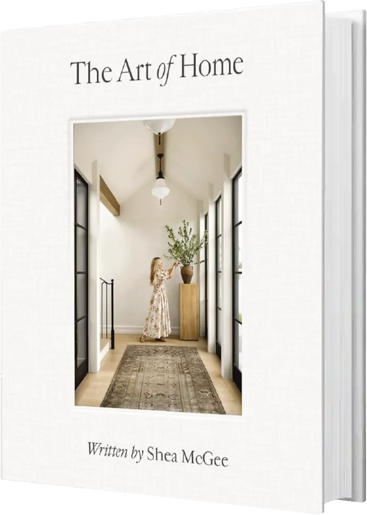
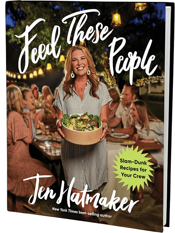
Product and book photography
Clean and close; 3D book covers when possible.
Video
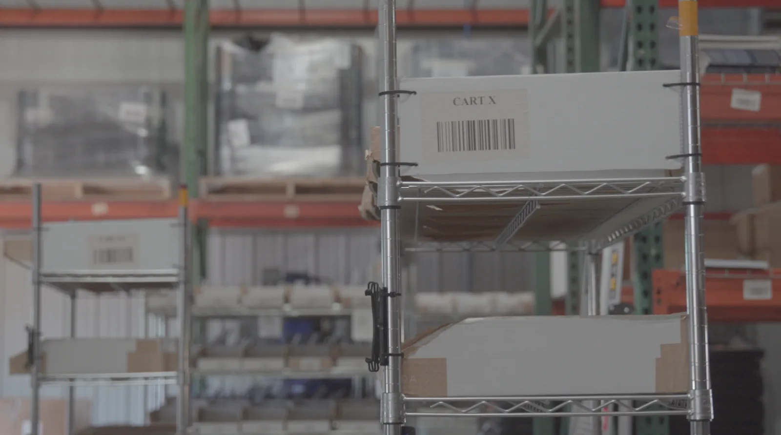 A still from company b-roll
Use real Givington's footage, never stock. On the website, hero video sits under the 65% black scrim whenever text runs on top of it.
All company b-roll lives in the master folder of Givington's marketing assets on Box.
Do
- Use real Givington's people and real client work.
- Keep photos rectangular with square corners.
- Frame photos with a 1px charcoal line on cream.
- Dim photos onto charcoal (tiles, photo heroes) or blue (testimonials).
Don't
- Use stock photography.
- Round the corners of photos.
- Put gradients over photos.
the brand, applied
Examples of approved brand collateral, built from and inspired by the Givington's design system components.
Website (Homepage Render shown below)
Visit givingtons.com ↗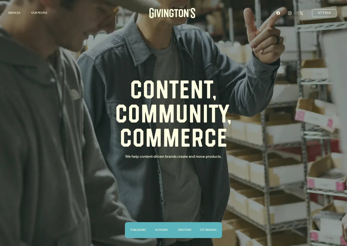
Where the brand lives
Applications and resources
get the files
Everything you need to make Givington's work on brand. Download the marks and color values here; find more marketing assets in Box. Work from these files rather than recreating artwork.
Logos · SVG
Black and White marks are for explicitly black-and-white deliverables only. Never use any mark in yellow or blue.
Color values, email logo and fonts
Licensed fonts, not available for download here. Questions about font use go to a brand contact below.
More resources
Brand questions